DNSSense
A new landing page, brand identity guidelines and marketing design for a DNS security company trusted by 10,000+ organizations.
- Company
- DNSSense
- Role
- Product & Brand Designer
- Sector
- Cybersecurity · Startup
- Platforms
- Web
- Tools
- Figma, Photoshop, Illustrator
- Live
- dnssense.com
Overview
DNSSense is a cybersecurity company founded in London. It puts the DNS protocol to work for security — AI-powered, plug-and-play solutions that stop threats at the DNS layer.
More than 10,000 companies across 74 countries trust it — a leading choice in DNS security for blue-chip companies and large networks.
As Product & Brand Designer, I took on three things: the new landing page, the brand identity guidelines and marketing design for social media.
Landing page
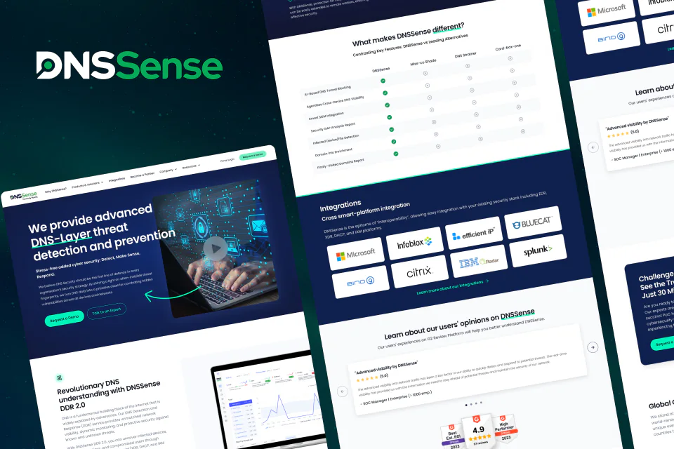
I redesigned the DNSSense landing page together with the company's marketing and development teams. One long page, top to bottom:
- A hero that says it straight: DNS-layer threat detection and prevention
- A side-by-side comparison with leading alternatives
- Integrations that plug into an existing security stack
- G2 reviews, and an invitation to challenge DNSSense with a proof of concept
Brand identity
A brand identity guide for DNSSense, built on a few essentials: the logo in colour and in black and white, a navy-and-green palette and Red Hat Display as the typeface.
Protection area & readability
Two rules keep the logo intact: a protection area around it, and readable sizes from A2 print down to the minimum — plus a 32×32 favicon. For both the horizontal and the stacked version.
Do's & don'ts
The most common mistakes to avoid, and how the logo sits on photography: its own colours on light images, a white DNS on dark ones.
Marketing design
Social media designs in the same navy and green — webinar announcements, welcomes for new team members and product messaging, each in several layouts.
orkun@buran:~$ contact --now
Let's get in sync.
Bring the intent. I'll take it from prompt to production — with you in the loop.